Why Are My Custom Pins Different from the Design?
Table of Contents


You’ve been looking forward to receiving your custom metal pins, only to find that the actual product looks different from what you expected. Frustrating, right? Don’t worry. As a custom pin manufacturer with more than 20 years of experience, today we’re going to talk about this common and frustrating problem and how to solve it.
Why Do Color Differences Occur?
Many customers believe, “If the design is this color, the finished product should be exactly the same color.” In reality, this is a common misunderstanding, because the design is a digital color, while the pin is a physical color. They are not working within the same system from the very beginning.
1. The Difference Between Screen Colors and Real-World Colors
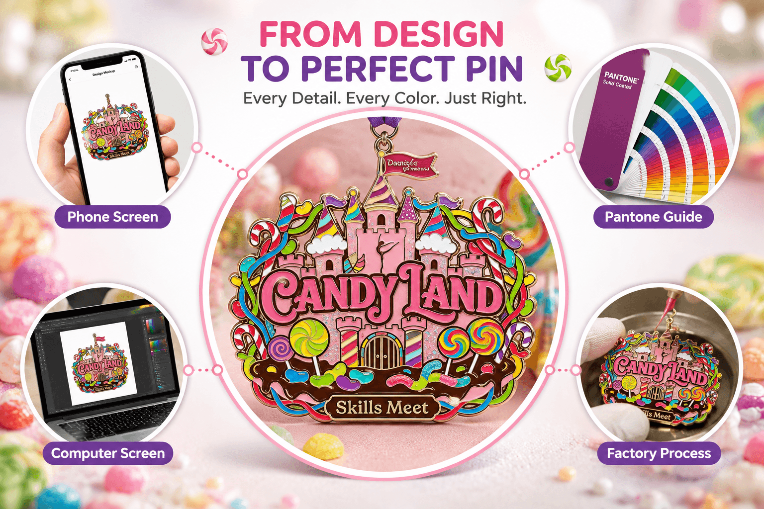
The color you see on a screen is not necessarily the same as the real color. What device do you usually use to check your design? A phone, tablet, or computer? In fact, different devices display colors differently. The same design may look one color on an iPhone, another on an Android phone, another on a Mac, and yet another on a Windows computer. Even on the same iPhone, the color may look different when the brightness is set to 100% versus 50%. Many times, customers think, “The design clearly looks like this color,” but what they are actually seeing is simply the color displayed by their own device, not the color itself.
2. RGB, CMYK, and Pantone Work Differently
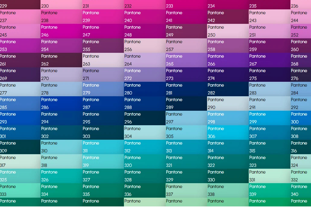
Designers mainly use RGB or CMYK, while pin production usually refers to Pantone (Pantone Color System). Simply put, computer screens use light to display colors, while pins use materials such as metal, enamel, and ink to present colors.
(Further Reading: Pantone Color Card Guide)
Therefore, some colors may look especially vivid on a computer screen but appear softer when actually made into a pin. This is especially true for fluorescent colors, highly saturated blues and purples, neon colors, and similar shades. The effect that a screen can display cannot always be completely reproduced with physical materials.
In addition, Pantone also has digital color references and physical color guides. For production, it is better to refer to the physical color guide rather than simply looking at the color on a computer screen.
Therefore, if there is a slight difference between the color in the design and the final pin, it does not necessarily mean that the factory made a mistake. It is simply because there is an inherent difference when digital colors are converted into physical colors.
| Main Color Use | Simple Explanation | |
|---|---|---|
| RGB | Phones, computers, and other screens | Colors displayed through screen light |
| CMYK | Standard printing | Colors created by mixing four types of ink |
| Pantone | Product and brand color communication | A standardized color number used to specify a particular color |
3. Color Matching Requires Experience and a Physical Color Guide
Color matching isn’t as simple as entering a number into a machine and getting the exact same color. During production, our technicians adjust the color based on the Pantone color guide and how the paint looks on the actual material. Different batches of paint, materials, and production conditions can also cause slight color variations.
At Maxemblem, we first determine the color standard based on the Pantone color number or design provided by the customer, then adjust the color according to the product material and production process. If the customer doesn’t provide a Pantone color number, we select a Pantone color that closely matches the design as a production reference and make further adjustments during sampling.
In other words, we don’t simply look at the design on a computer screen and “match the color by feel.” We first establish a clear color standard that can be used for production and future repeat orders.
4. Production Processes
Different production processes also produce different color effects. For example, painted finishes tend to have high color saturation and a refined appearance, while printed finishes may have a slightly grainy texture, and imitation hard enamel tends to have a more matte and delicate appearance.
Many collectible pins use special finishes such as pearl effects, glitter, cat-eye effects, glow-in-the-dark, chameleon, and holographic finishes. These processes are beautiful, but they also make color control more complicated. The final color depends not only on the paint, but also on the base color, plating color, light reflection, transparency, and refraction. For example, transparent blue with gold plating may sometimes appear slightly green, while transparent blue with silver plating may sometimes appear more blue.The same enamel badge may also look like a different color under indoor lighting. natural light, or photography lights. Therefore, for special finishes, the color guide can only be used as a reference, and the color cannot be completely reproduced according to the color guide.
Click here to learn more: Common Pin Manufacturing Processes.
How Maxemblem Helps Minimize Color Differences
At Maxemblem, we control color consistency through several steps:
① Design Review: We establish the color standard based on the customer’s artwork, Pantone color codes, or physical reference samples.
② Production Process Evaluation: We evaluate how the material, plating finish, and production process may affect the final color appearance of the pin.
③ Color Matching & Sampling: Based on the confirmed color standard, our team matches the color and creates a physical sample so the final color can be reviewed before mass production.
④ Sample Approval: Before mass production, customers can review and approve the physical sample instead of relying only on the colors shown on a computer screen.
⑤ Mass Production: Once the sample is approved, we use the confirmed sample and production records as references during mass production to maintain color consistency across the batch.
⑥ Repeat Order Records: For long-term customers, we keep previous production and color reference records whenever possible, making it easier to follow the same standards for future repeat orders.
How Customers Can Minimize Color Differences
1. Communicate in Advance Before Placing an Order
Before placing an order, communicate with the manufacturer in advance and clearly define the color standard. It is best to specify the color using a Pantone color number. The more detailed the information, the better.
For example, instead of simply saying, “Please make it this blue,” or only sending a screenshot, it is better to provide a specific color number such as Pantone 186C, 299C, or 485C. This is the most efficient approach and can minimize color differences. Also, try not to use Pantone colors with percentages. If a percentage must be used, it is better to choose an even percentage such as 50%, because 90% and 80% may end up producing the same color, and colors with percentages are more likely to show noticeable color differences.
2. Make a Sample Before Mass Production
For orders with strict color requirements, Maxemblem recommends confirming a physical sample before mass production.This is the most effective way to control color differences. For any project with high color requirements, always confirm the sample first, and only place the large production order after you are satisfied with the sample. Try not to skip the sampling process. Otherwise, if you are unhappy with the color after mass production, it may affect your purchasing experience.
For more specific information about “how to check product quality before placing an order”, I have summarized it in this article. Feel free to read it if needed.
3. Don’t Switch Factories Too Easily
If the same design has been produced for many years, the best option is usually to continue working with the original factory for repeat orders. This is because the original factory has the previous color-matching records, production data, and physical samples, which are difficult for a new factory to reproduce. Therefore, choosing a reliable factory from the beginning is very important. When placing your first order, you can first confirm the product quality and then continue working with the same factory long term, reducing the uncontrollable factors that may affect color consistency as much as possible.
4. For Important Projects, Consider Buying a Physical Pantone Color Guide
If you are a brand, studio, independent designer, or collector who cares about color consistency, having a physical Pantone color guide is very useful. This allows your product colors to be standardized according to an industry reference, making it easier for the manufacturer to understand your requirements and making communication easier for both sides.
5. Accept Reasonable Differences with Special Finishes
Special finishes such as transparent enamel, pearl effects, glitter, and glow-in-the-dark effects can naturally change the color. Instead of requiring them to look exactly the same as the design, you can focus on whether the overall appearance of the finished product looks good. In our more than 20 years of experience, we have also seen cases where the finished product looked slightly different from the original design, but actually looked even more impressive than the design, and the customer was ultimately very satisfied with the result.
6. Adjustments and After-Sales Solutions
If the finished product has a significant difference from the approved sample, you should contact the manufacturer promptly to check the sample records and production standards, and discuss solutions such as replacement production, reworking, or a refund based on the actual situation, so that losses for both sides can be minimized.
Conclusion
A slight color difference in custom pins does not necessarily mean that there was a production problem. From the design to the finished product, screen display, Pantone color numbers, metal base color, plating, production processes, and lighting can all make the color look slightly different. Although both sides will do their best to minimize color differences, if you are concerned about color variations, we recommend providing a Pantone color number in advance and confirming a physical sample before mass production. This allows the manufacturer to understand your color requirements more accurately and helps ensure that the pins you receive are closer to what you had in mind.